:Draft Punk:
“Great design should work from every angle.”
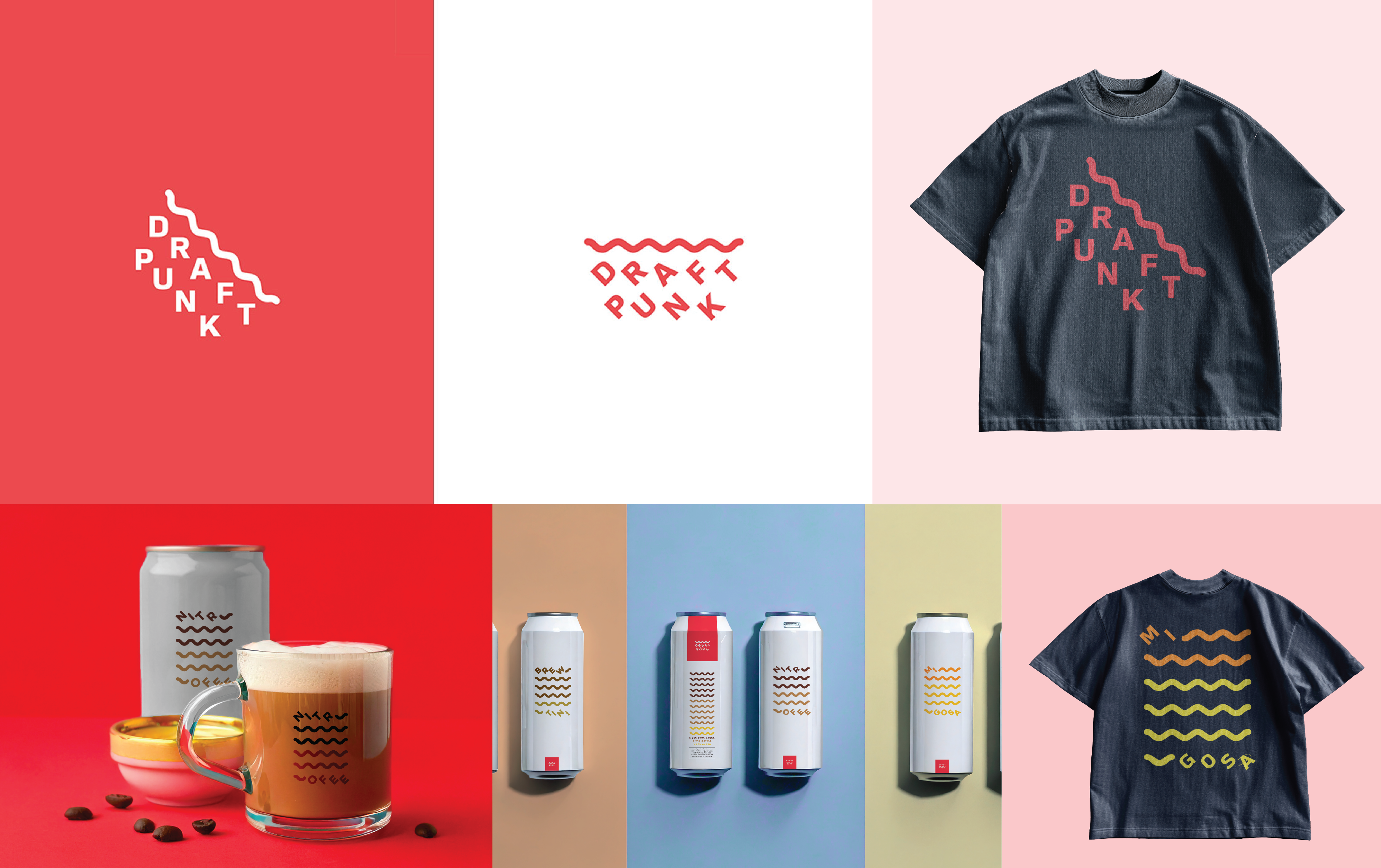
I can’t remember who said it, but I’m sure I read it in a design book at some point. That insight stuck with me. Beer logos are usually seen from two key angles — tilted mid-sip, and upright on a table. So I designed this mark to look good from every angle, just like the quote says.
Draft Punk is this scrappy little brewery in Northern California doing something no one asked for—mixing beer with things like coffee, juice, and mimosas, etc. It’s like the mad scientist of craft brewing. Weird? Yes. But somehow, it works.
They came to me for branding, and I knew one thing: they couldn’t look like every other microbrewery with a beard logo and a Latin motto about grain. So I gave them something simple and sharp. No gimmicks. Just a clean, modern identity that stood out on the shelf and didn’t reek of flannel vibes.
But the system had to do more than just look cool on glassware. Each Draft Punk brew has its own bizarre mix of ingredients, so I built a flexible identity system that let us showcase each concoction without the whole brand looking like a design student’s Pinterest board. It’s clean, extendable, and fully weird-compatible.
<home